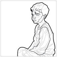
A simple technique we can employ to add variety and direct our audience's attention is by varying the weight of the lines within our sketch.
Line weight is the visual strength or intensity of a line. We can achieve different line weights or intensities by changing the thickness of a line or changing how light or dark a line appears. We can even do both by changing the thickness and the darkness of a line.
The Benefits of Varying the Weight of a Line
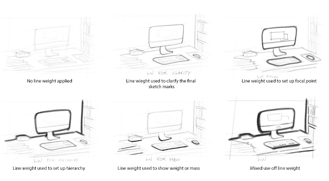
Using a variety of line weights in our drawings provides us with several benefits. Employing line weight assists in directing our audience's attention, establishing a visual hierarchy, providing contrast, illustrating depth and mass, and improving the readability of a drawing.
Placing a thick or dark line in a drawing creates contrast. The stronger the contrast, the greater the pull of our attention towards that contrast is. We, humans, are hardwired to look for contrast. We unconsciously search it out. If we want to emphasize an element within the drawing, we can draw thick lines on that part of the drawing. Compared to the thin lines on the rest of the drawing, the thick lines will stand out. In doing this, we use line weight to help establish a focal point or the main area we want our audience to focus their attention on.
We can use varying line weights to indicate the mass, density, or volume of an object. We can use a heavier line to give the object in the drawing a heavier or denser appearance. We can draw light lines for the smaller elements and dark lines for the larger elements to emphasize the objects' mass.
Lines of different weights can also help convey depth and perspective. For example, if we draw a thicker line on the elements of a scene that are the closest to us and thinner lines for that which is further away, we emphasize the distance between those elements.
Using different thicknesses of lines always helps us establish a visual hierarchy. This concept is similar to using the technique to establish a focal point. We want to control the progress of our audience's attention as they scan through the design. We do this by changing the intensity of the lines as we move down the hierarchy.
Give it a Try
The best way to see how this works is to explore the different uses of varying the line weights is to draw something emphasizing various parts of the drawing with varying boldnesses or thicknesses of line. Draw a line drawing of a subject or scene. Next, test out using different line weights within that drawing. Then draw it again, testing emphasizing other parts of the drawing. You'll begin to see how line weight can impact a drawing and learn to incorporate it into your style.


